The Evolution Of Famous Car Logos Across The Decades
Since the dawn of civilization, humans have marked objects with images, and this ancient ritual has followed us into our modern lives. This is especially true in the business world; a logo defines a company and gives it an identity. Filled with history and symbolism, these icons express the totality of a business within a single image; car companies are no exception. What follows is a look at fifteen car logos that have captured driver’s imaginations. Along the way, we discuss a few alterations and transformations that make these logos among the most famous in the world.
A.L.F.A
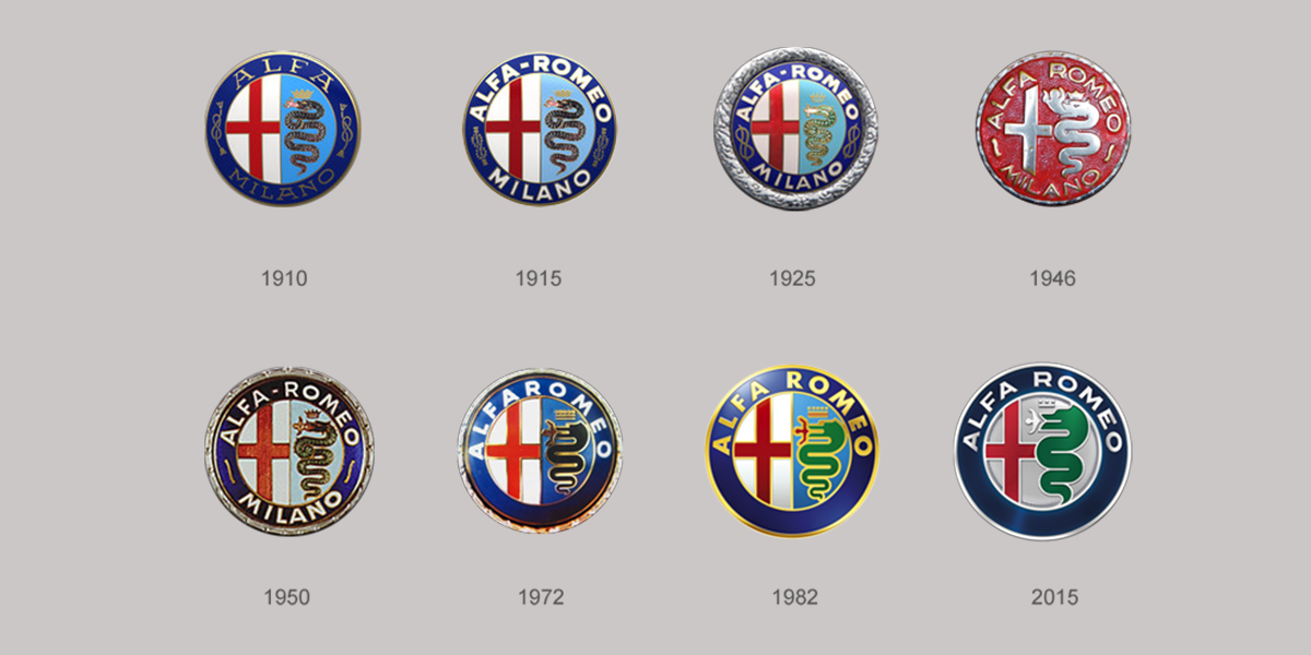
Inspired by Milan’s red cross and the biscione of the House of Visconti, A.L.F.A. created some of their earliest logos by combining these images and surrounding them with the company letters and the word “Milano.” As early as 1920, the name “Romeo” was added. This has remained the company's image for decades, with the last major alteration occurring in 1971 when “Milano” was removed. Insignificant redesigns have since kept this logo modern in appearance.
Renault
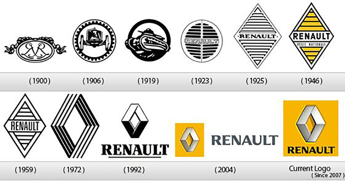
The first Renault logo in 1900 displayed the initials of the three brothers, and within six years had changed to the front of a car surrounded by a gear. By the early 1920s, Renault’s cars displayed a circle with grills that had “Renault” in the middle. In 1925 the diamond-shaped logo appeared. Minor alterations continued until 1972 when Viktor Vasarely redesigned the diamond into a rhombus with each side positioned over the other. In 1992 the name “Renault” was added to the logo and has remained this way.
Peugeot
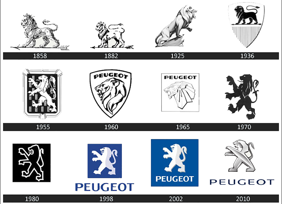
The lion has been a part of Peugeot’s logo since 1858. Various poses of a lion striding were used for decades. In the mid-1920s the lion was altered by making it face to the right, and within a decade it had returned to a more traditional pose. In 1955, the icon was given an aggressive rearing up stance. This has lasted until today, with the exception being the 1960s when the icon was changed to a lion head. 1998 saw the last major alteration with the addition of “Peugeot” to the logo.
Mitsubishi
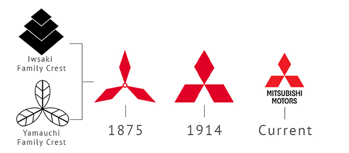
In 1873, Yataro Iwasaki acquired the shipping business of the Tosa Clan. He renamed this new enterprise “Mitsubishi,” a combination of the Japanese words for “three” and “water chestnut,” which the Japanese use to denote a diamond shape. The word “Mitsubishi” translates into “three diamonds.” The logo itself is a combination of the founder’s family crest of three stacked diamonds and the three-leaf crest of the Tosa Clan. Minor adjustments were made up until 1914 when the company logo was trademarked. It has remained the same since that time.
SAAB
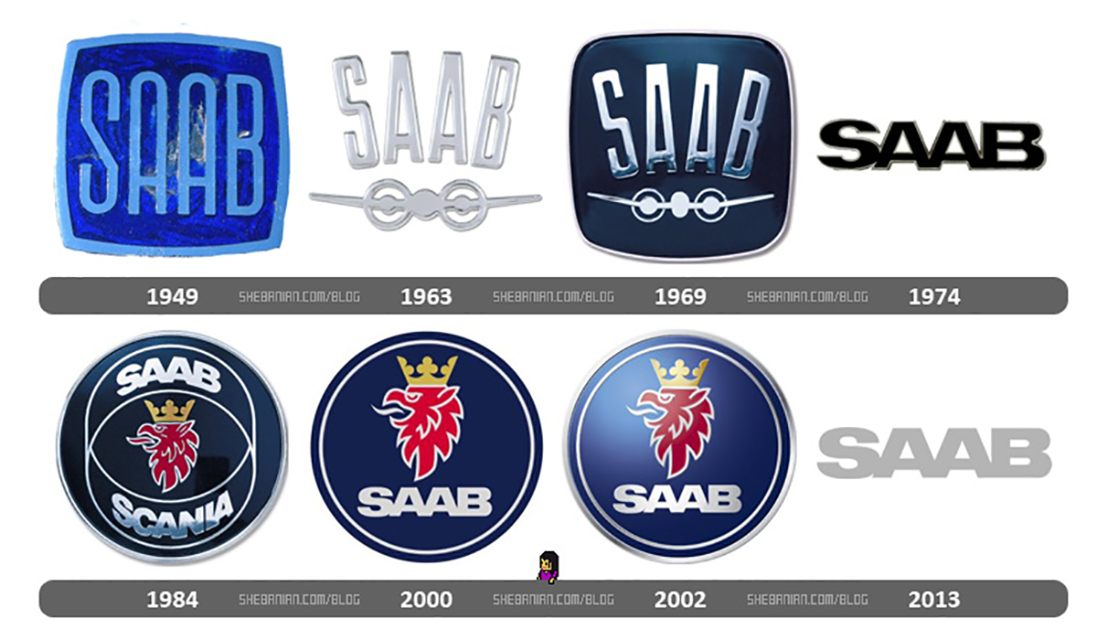
SAAB produced cars for less than seventy years but did alter its logo more than once. Their first major logo had “SAAB” in a blue square in 1949. The silhouette of a plane was added in 1963. Eleven years later the company logo was changed to just the name. A redesign of the image came in 1984 when the words”SAAB” and “SCANIA” were added to a disk along with a griffon’s head. In 2000 the logo dropped the word “SCANIA.” The final logo consists of just the name itself.
Aston Martin
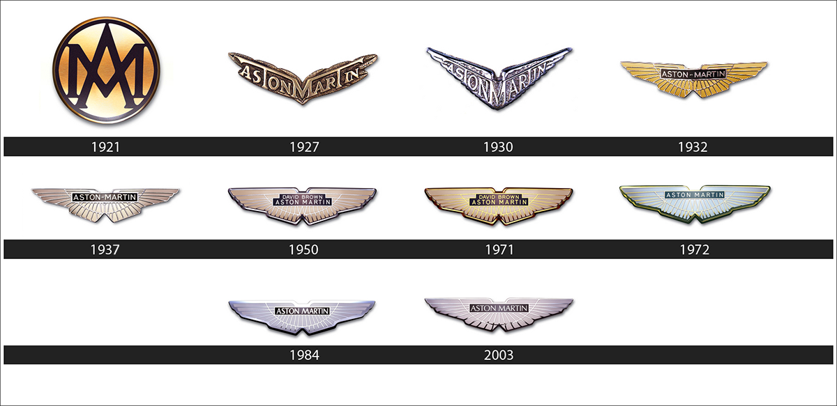
Combining the name of a company founder and the race course he drove on, the first image of Aston Martin appeared in 1921 as a disc that weaved the letters “A” and “M” together. Six years later the logo was reimagined as a set of wings that pointed upwards with “Aston Martin” inside of them. By 1937 the wings became level, and this design has survived the test of time with only one major alteration. From 1950-1971 the name “David Brown” appeared within the icon above “Aston Martin.”
Cadillac
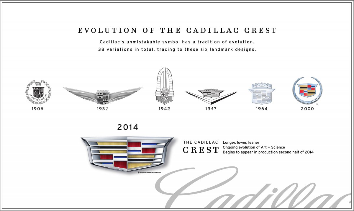
Since the early 1900s, the Cadillac logo has used a combination of the company name and a crest design based on the coat of arms of Detroit’s founder, Antoine de la Mothe Cadillac. In 1932, wings were added to the sides of the Buick badge. By 1947 these wings had morphed into a “V” shape below the logo’s shield. In the early 1960s, a wreath was substituted for the wings in the continuing design evolution. By 2000, the crown was removed from the crest with the wreath being removedfifteen years later.
FIAT
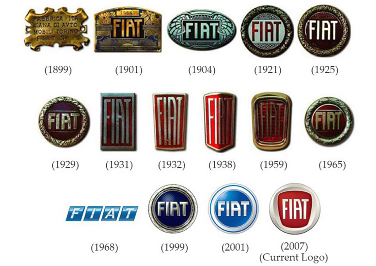
Fabbrica Italiana di Automobili Torino used their complete name as the company logo starting in 1899. In 1901 the image changed to “FIAT” surrounded by various engravings. By 1921 the logo became a disc with “FIAT” surrounded by a wreath. In the early 1930s, the icon began a series of changes that included tall and thin shields with “FIAT” in the center. In 1968 the badge became four blue rhombuses with letters of the company name in each. At the end of the century, the wreath circle returned.
Buick
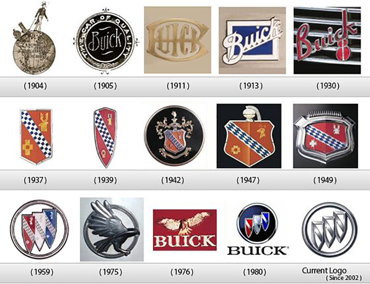
Buick, the oldest automobile brand in America, used only the name in its earliest logo designs. In 1937, Buick created a symbol based on the Buick family’s coat of arms. This was replaced in 1959 with three colored shields representing the LeSabre, Invicta, and Electra car models. During the production of the Skyhawk in the mid to late ‘70s, the company adopted an image of a hawk that was nicknamed “Happy.” Buick returned to a simplified version of the three shields in 1980, removing the shield colors in 2002.
Volkswagen
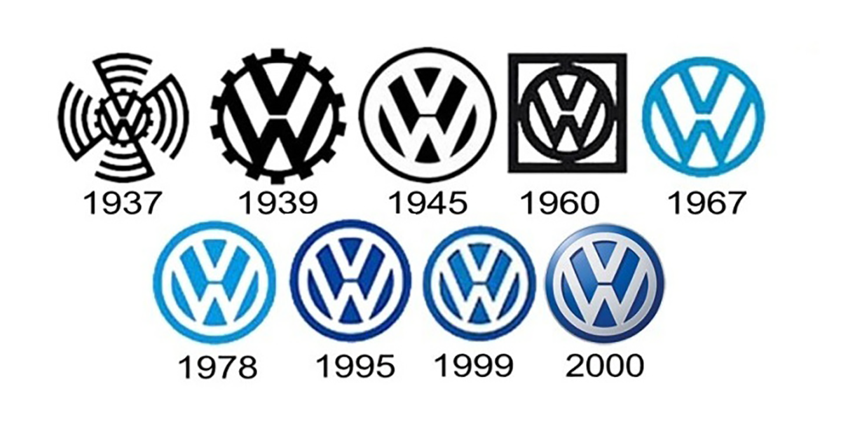
Created in 1930s Germany, Volkswagen’s first logo incorporates the familiar “VW” surrounded by a wheel gear with swastika-like lines flowing out from it. Right before the start of WWII, the design was changed to remove the swastika looking lines, leaving just the “VW” surrounded by a gear. After the war was over the company logo was changed by removing the gear, leaving the familiar circle with “VW” inside that has survived to this day with just minor alterations to keep the image current.
Ford
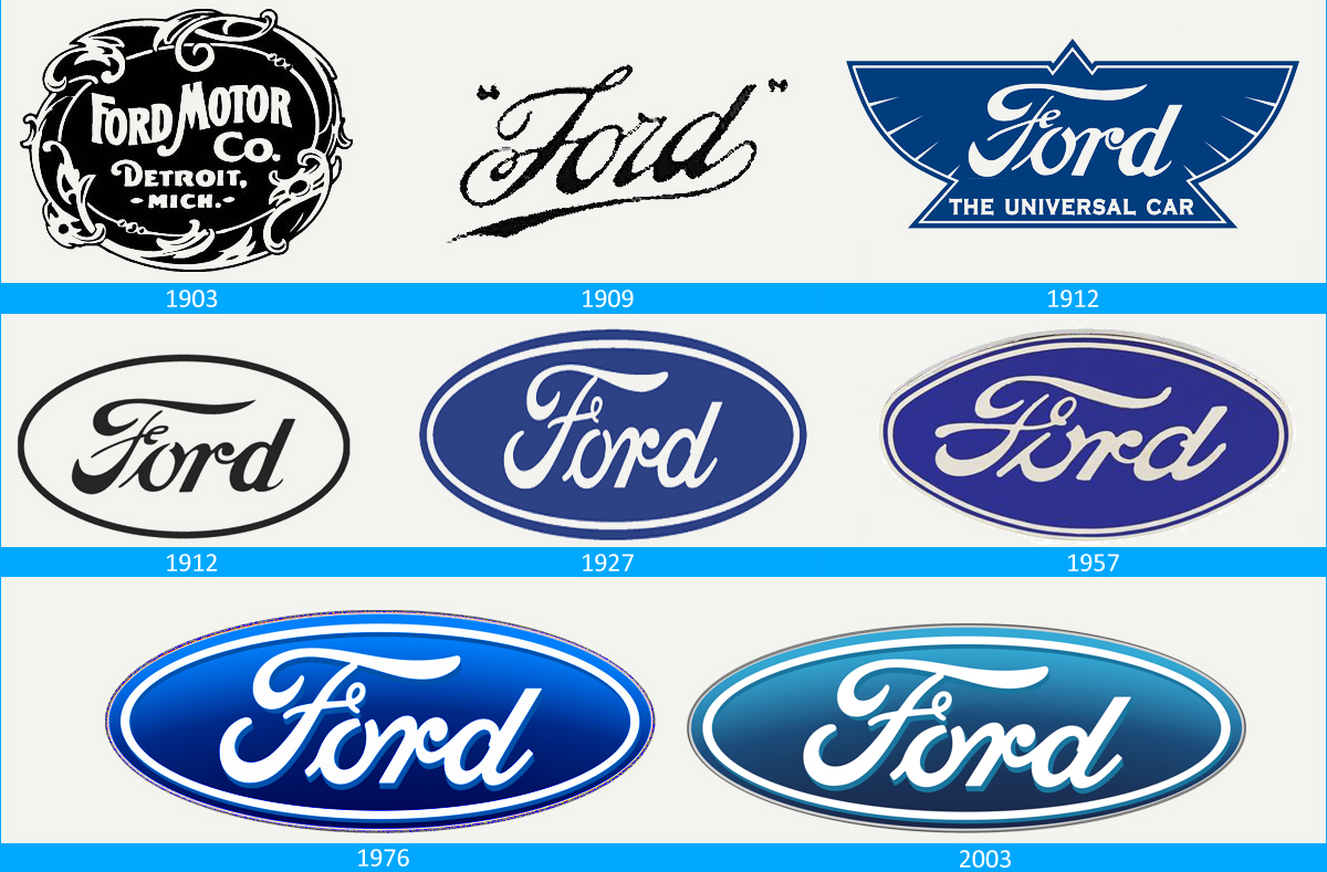
In 1903, Ford’s first logo was a black and white circle with decorative edges that read “Ford Motor Co. Detroit Mich.” in the center. By 1909 the image had changed to “Ford” in a cursive font. In 1912 this was placed inside an oval and altered to reflect Henry Ford’s own handwriting. During the 1920s this design began to display the iconic royal blue color. Over the following years, the image took on a lemon-shaped outline, returning to an oval in 1976.
Mazda
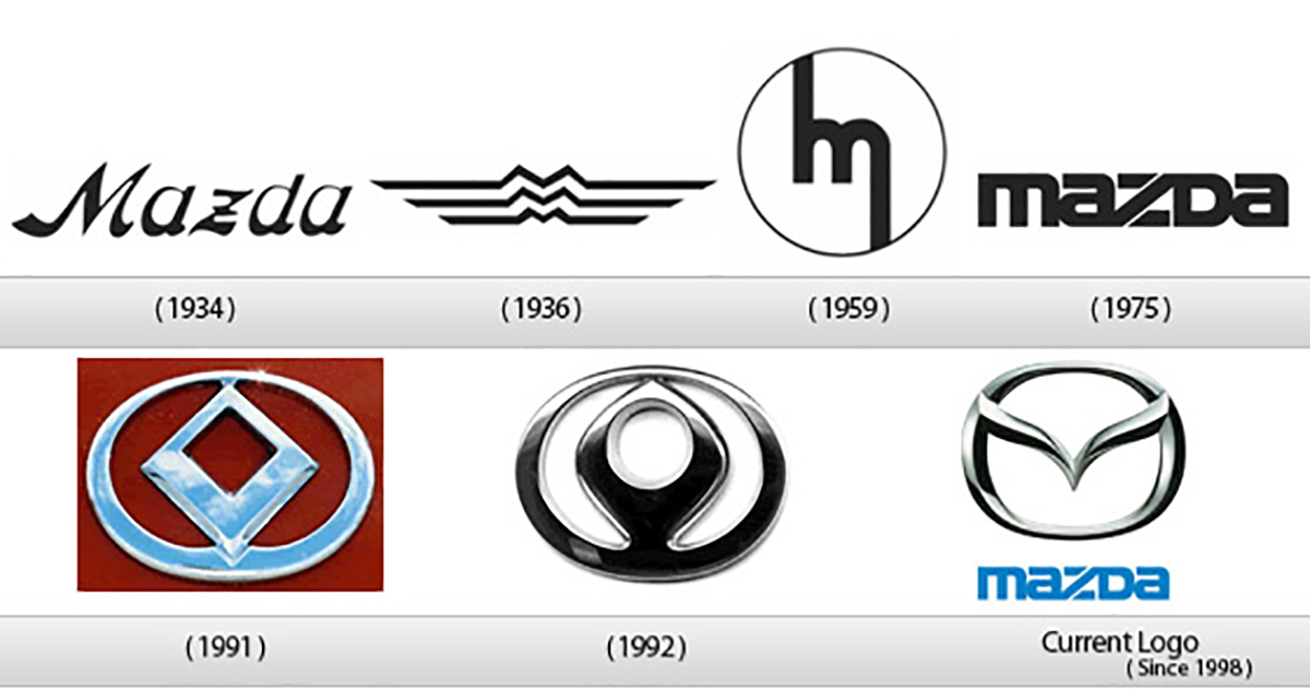
Named after the company founder as well as the deity Ahura Mazda, it is no wonder that the first logo the company used was simply the name “Mazda.”. In 1936 the logo was redesigned with an image representing Hiroshima and Mazda Motor Manufacturer by an “M” stacked three times. After WWII, the logo was designed with a single “M.” Mazda later used just the company name. A new logo design blending symbols of light, sun, and wings were made in 1991. The most recent 1997 design creates an M using an owl within a circle.
Mercedes
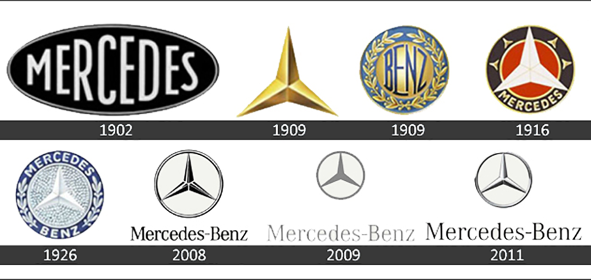
The first company logo for Mercedes was simply the word itself. In 1909, the three-pointed star was created from art sketched on a postcard. Seven years later this star was put within a circle with the name “Mercedes” placed underneath it. After a company merger, “Mercedes” and “Benz” were added to the outer edge of the badge along with a wreath decoration. Minor alterations continued through the decades with the last major transformation being the name “Mercedes-Benz” being placed under a thin circle with no decoration.
Audi
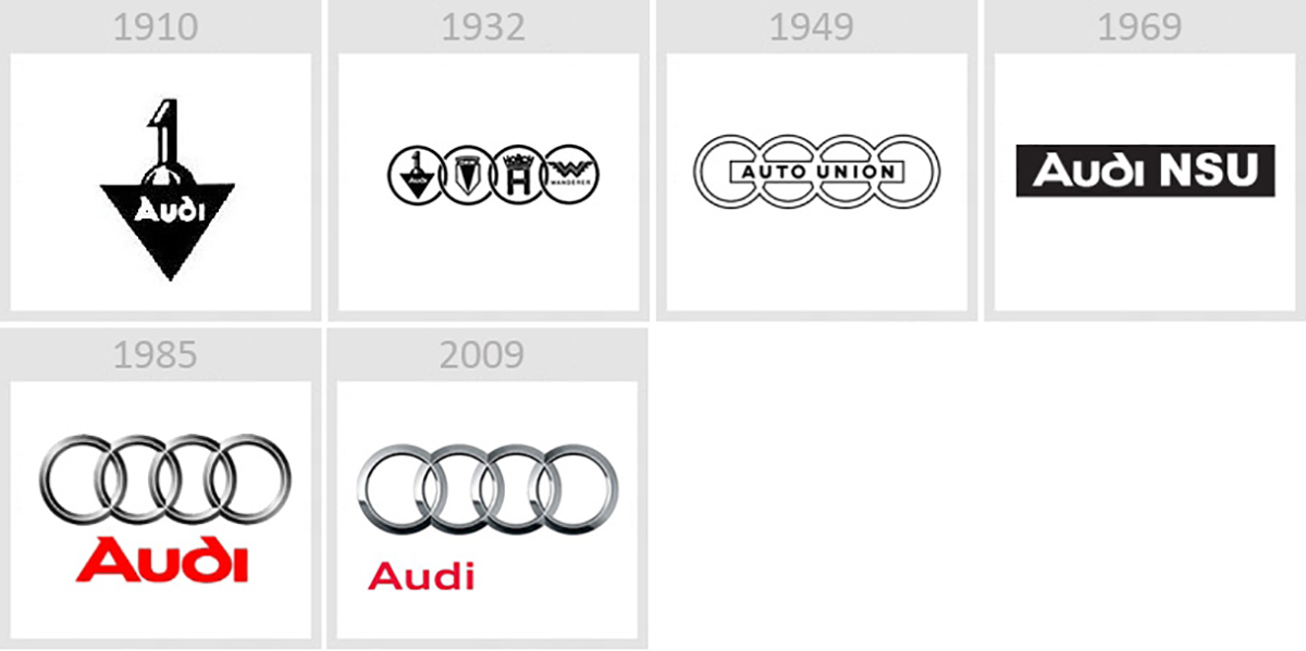
In 1909, August Horch created “Audi” by translating his name into Latin. The company logo became this name placed in an upside-down triangle with the number one placed on top. 1932 saw Audi merge with three other companies to form the Auto Union; this merger was symbolized by four interlocking circles. After a few years, the words “Auto Union” were placed across the circles and remained there until 1969. In 1985, Audi returned to the logo of four circles that is used by the company today.
BMW
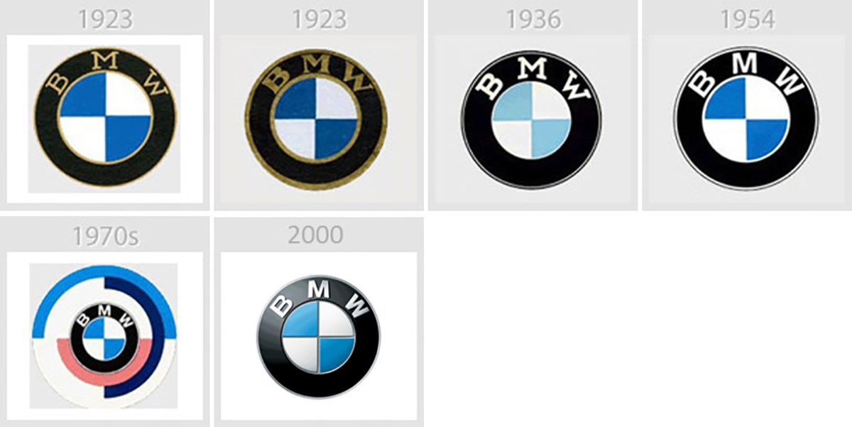
Rapp Motors was renamed BMW in 1917. While the company’s history is rooted in aircraft engine production, the BMW roundel does not represent a silver propeller spinning in a blue sky. The BMW letters are placed in a border that surrounds the blue and white checker pattern which actually represent the Bavarian flag with the color order reversed for legal purposes. This logo has remained unchanged except for small alterations to letter font, spacing, and slight color adjustments since its creation.


